Creating solutions for a sharp drop-off & increasing sign-up conversion
Overview
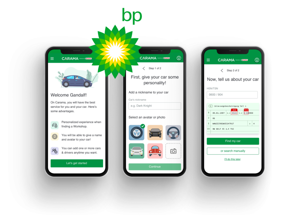
CARAMA is a digital platform designed to connect car owners (B2C) to garage owners (B2B) for any car maintenance.
Within CARAMA, car owners can easily find, compare and book a service with a garage that meets their needs.
Problem
The sharp decline in user engagement from the B2B homepage was impacting sign-up conversions and reducing awareness of CARAMA benefits. The goal was to identify the underlying issues causing this drop-off and develop strategies to increase sign-up conversions while enhancing awareness of CARAMA benefits.
Role
User Experience; Wireframing & Prototyping; Usability Testing; Traffic data analyses.
Responsibilities
Working in a cross-functional team, I led every phase of the project, from data analyses, discovery (problem definition) and ideation process to the creation of wireframes, prototypes and delivery of final designs.
Process
Empathising with our users
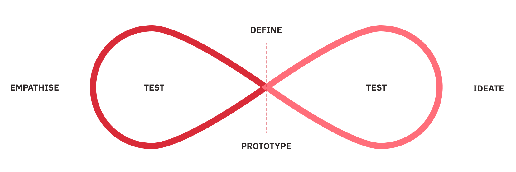
The first step was to identify the problem causing a sharp drop-off from the B2B homepage. Through the support of the Product Owner and Business Analyst, we decided to base our process on the Design Thinking Methodology.
Due to Covid-19 restrictions, time-constraints and language barriers (the users are German speakers), we couldn’t do 1:1 user interviews. Therefore, we primarily analysed data from Google Analytics, and then I encouraged our team to implement Hotjar, so we could empathise with our users and understand their behaviour.
All the video recordings were live, anonymous, and undetected, which we found to be reliable since they represented user behaviour in a natural environment.
I analysed more than 50 user session recordings and more than 500 heatmaps on Hotjar, which acted as hybrid quantitative/qualitative research — identifying user’s pain points, opportunities, user’s patterns and insights.
Since this project could change the digital face of CARAMA, I interviewed stakeholders, product and marketing teams.
Key findings
Once I collected and summarised all data and defined the main issues, I started comparing the previous hypothesis with critical problems uncovered. When this stage was complete, I started working on concepts and possible design solutions.
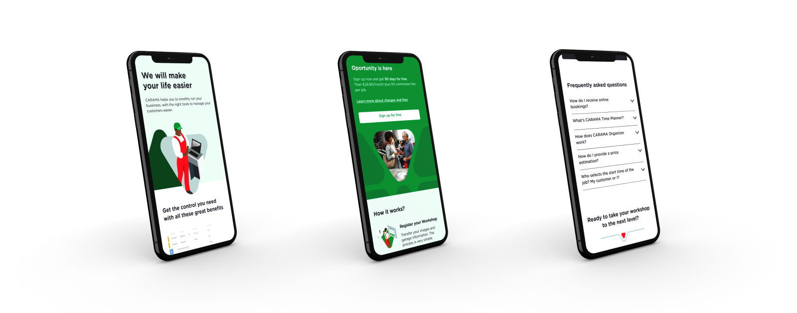
Wireframing & Prototyping
With key issues defined, it was time to start working on concepts and possible design solutions.
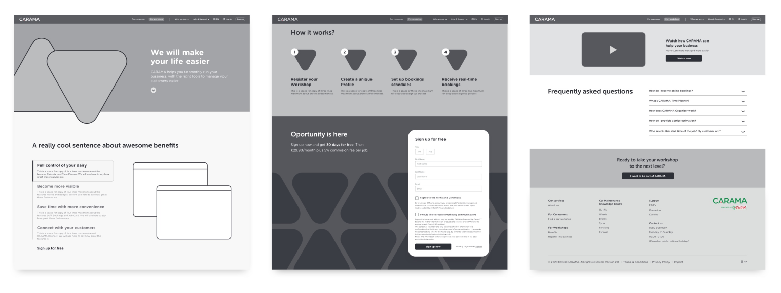
Talking to the Product Owner and stakeholders, and based on the research done, we decided that the best approach would be to create a new landing page as a starting for users.
With that decided, I started working on the Wireframes for both, Landing page and Homepage.
A desktop-first approach was decided since most of our traffic our coming from desktop devices. However, I created also a responsive design (for mobile and tablet) right after the testing phase.
Once the direction was selected and approved by the PO, I started working on high fidelity visual design with interaction. This phase was crucial because the prototypes would be used to test all the design solutions created with the users.
It’s worth to mention that I discussed the design and interactions with developers to ensure the team was on the same page.
All the prototypes were created using the Sketch app and Figma tools, based on CARAMA Style Guide I had previously worked on.
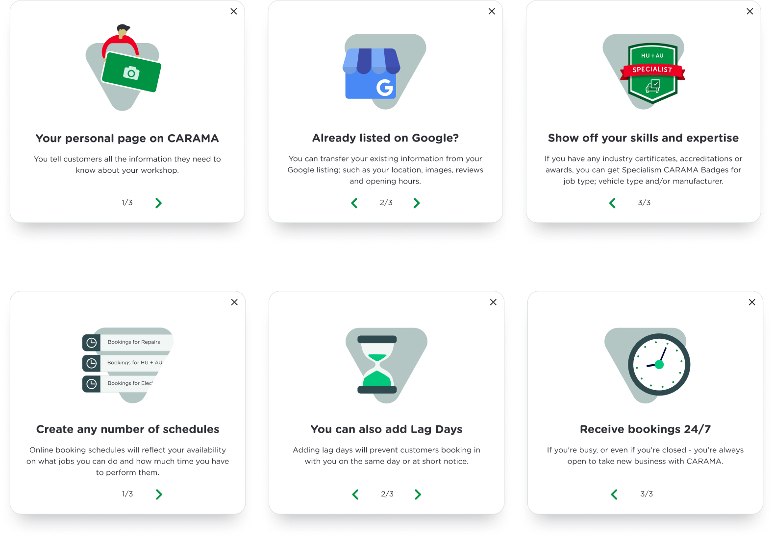
Testing and validation
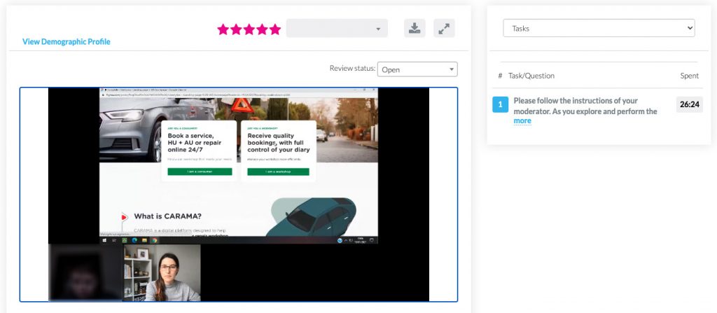
In order to validate whether the new designs would solve the user and business problems, I conducted usability testing (moderated and unmoderated) using the Userlytics platform with our primary users.
The first step was to write a script including a scenario and different tasks.
Here are some of the goals:
Understand the information displayed on the page;
Be able to find the right section for their business on the landing page;
Find pricing information, and how do users they feel about it;
Read the content on the page (including benefits);
How well users could understand how the product works;
How easy/difficult was to participants to interact with the page;
Within the Userlytics platform, I created a custom screener based on our specific persona — garage owners, +45 years old, German, and English speaker — and launched the test with 5 participants.
I was moderating a remote usabilitity testing by Userlytics
During the session, I observed how they interacted with the prototype, analysing their behaviours and thoughts.
The usability session revealed that:
100% of completion rate;
5 out of 5 participants were able to find the information they needed;
5 out of 5 participants were satisfied with the level of information on the page and how clear and concise it was;
5 out of 5 participants were able to sign up;
4 ou of 5 participants scrolled down 75% of the page or more;
4 ou of 5 participants considered the service for their business;
Even though this was the final stage, this was also an iterative process. Thus, the results and feedback from participants were used to refine some more elements and interactions, and more testing.
Check my other UX Cases 👇
Shell Market Hub Download Centre
Increasing productivity and reducing annual costs by solving challenges faced by the Marketing Team