Implementing the sign up (registration) & onboarding process
Overview
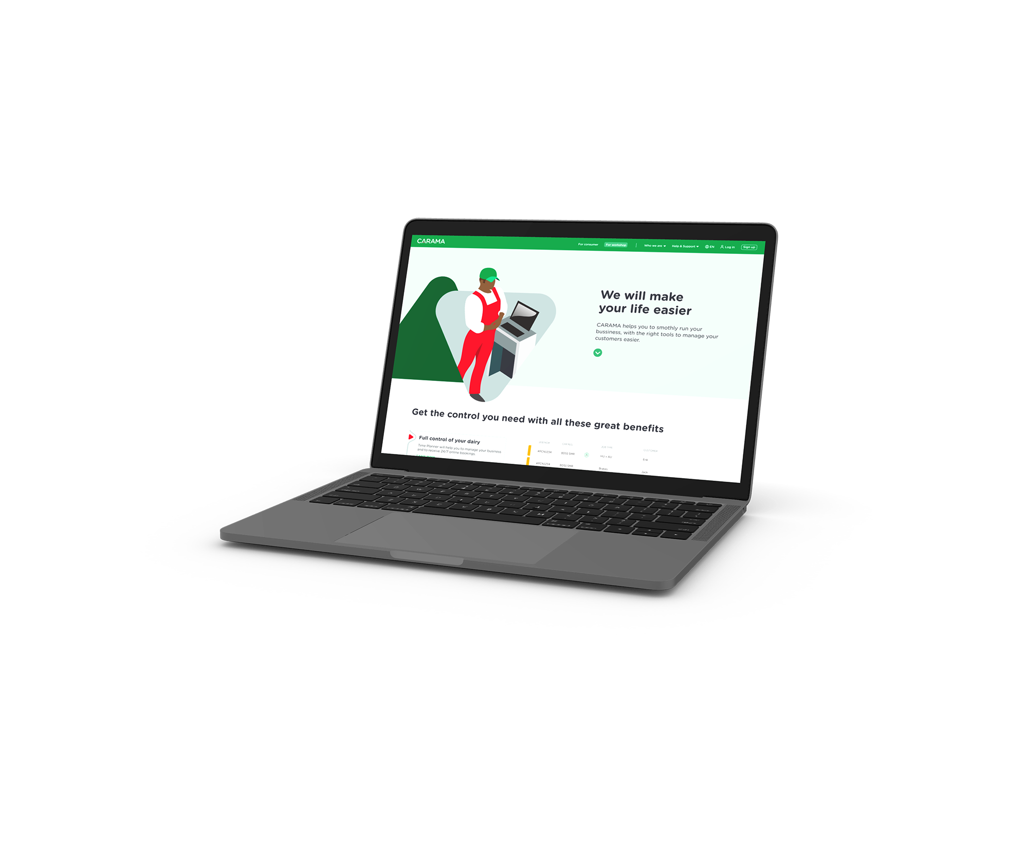
The Carama project, powered by Castrol, is a digital platform that connects car owners (B2C) with trusted garages and workshops (B2B) for car maintenance and repair services.
This service facilitates easy booking, comparison, and selection of garages that best meet the users’ needs.
Role
User Experience; Strategy; Wireframing & Prototyping; Usability Testing; Data analyses.
Responsibilities
I was part of every phase of this project, where the design team and I had to understand the business context, project timeline, resources, and constraints. And then, where I led the design of user flows, wireframes, prototypes, evaluation and the delivery of final designs.
The Problem
Our platform supported both B2B and B2C services, but initially lacked a good registration process for B2C users, with no proper onboarding experience or any kind of personalisation.
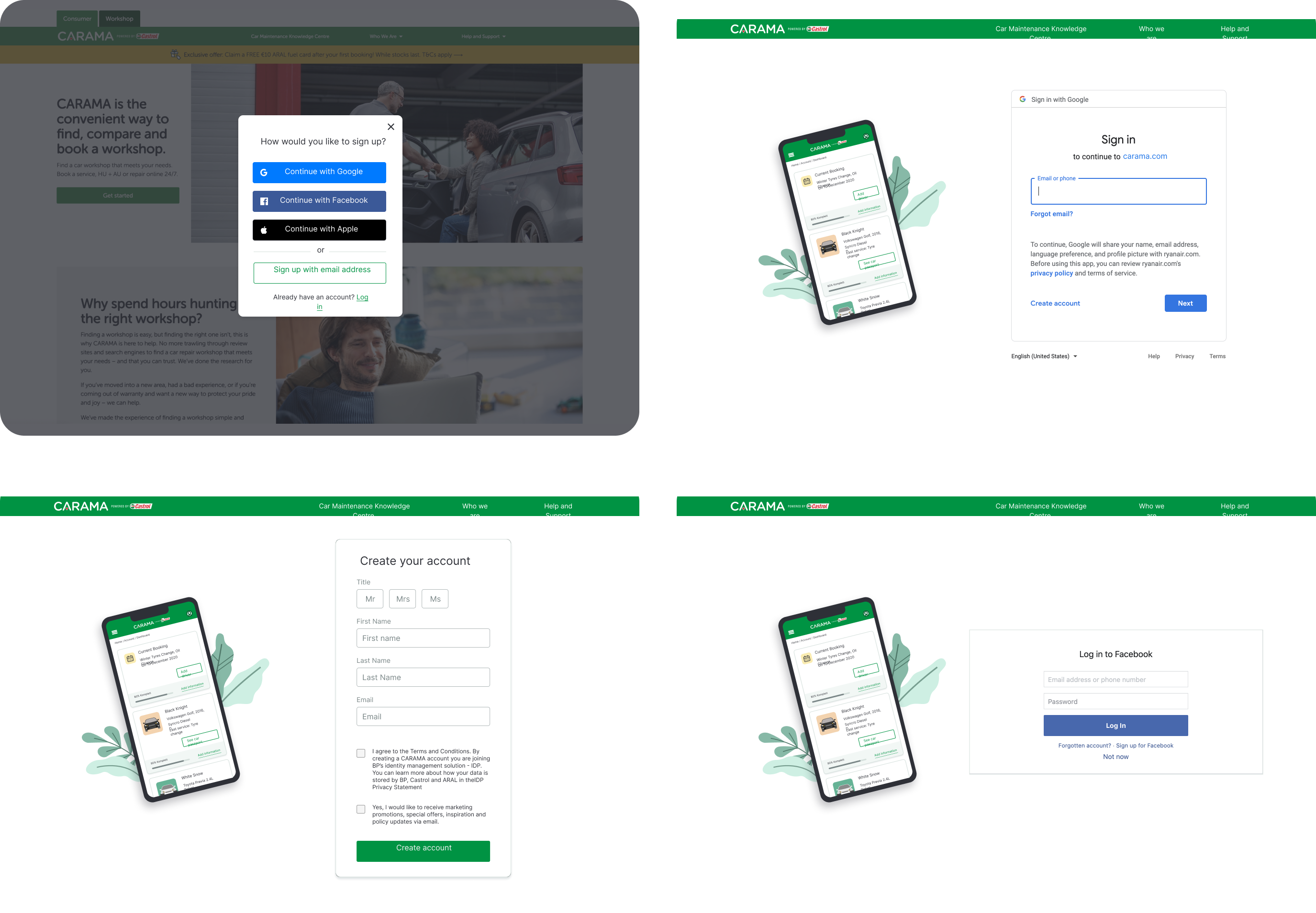
This gap also highlighted issues for B2B users, such as confusion caused by receiving three different emails during registration and complications from the absence of social media sign-up options.
UX impact
By implementing streamlining the sign-up and onboarding processes, we achieved:
✅ Improved the user engagement and sign-up conversion by 27% when adding personal customization, so the users feel more connected to the product
✅ Minimized user confusion by streamlining the registration process, minimizing the number of emails received, and offering social sign-up options to simplify account creation.
✅ Raised user satisfaction and adoption rates by designing a customizable dashboard tailored to their needs.
✅ Reduced the average onboarding process time by 30% compared to the B2B approach—asking for essential information first and delaying non-essential questions.
Process
First step first
With restrict information about the right problem to be solved, we firstly aimed to clearly define the design problem and understand the business context to align our design with the goals. Equally important was investigating users’ needs and pain points to create a solution that balanced simplicity and practicality.
We followed the Design Thinking Methodology.
Insights and logical questions
After discussing with stakeholders and gathering key project details like business context, timeline, resources, and constraints, we focused on answering these key questions:
Why is this feature important?
What impact will it have on the business?
What problem are we solving?
How does this feature benefit the customer?
What business opportunities does it create?
Insights from Previous Research and Key Discovery
Earlier in the project, UX researchers had conducted both qualitative and quantitative studies with our B2C users, providing us with valuable data, including persona, empathy map, and blueprint.
A key finding in this phase was discovering that our current B2B users (garage owners) were struggling with the existing registration process. Since the new B2C registration process would use the same platform (SalesForce), we recognized that this issue could persist and affect our future users as well.
The current flow was long and confusing
We quickly realized that the existing registration flow was confusing and needed improvement.
Users were overwhelmed by 3 separate emails:
thank-you message
welcome email with a confirmation link
marketing opt-in confirmation.This was simply too much!
This was simply too much!
And there was lack of social media sign-ups
Additionally, the absence of social media sign-up options was a glaring issue—in today’s digital age, offering social media sign-in is essential for simplifying the registration process and providing users with a convenient alternative to mandatory account creation.
Armed with insights from our research and competitor analysis, we began mapping out the current (“as-is”) and ideal (“to-be”) user flows, focusing on creating a seamless experience. Throughout this process, I collaborated closely with developers to navigate technical constraints and ensure our solutions were both feasible and effective.
We created user flows for 2 different starting points:
1. registration from the homepage
2. registration from the Search & Booking journey
Ideation & user story technique
I held ideation workshops to generate ideas and identify potential solutions to the problem we were addressing, including new features and functionalities.
During this phase, I introduced the User Story technique, which I find particularly effective.
This approach involves creating user stories in natural language to better understand and explore the user’s context and needs.
👨🏻🦰
As a car owner I want to view my bookings so I access information about it anytime.
👩🏽
As a car owner I want to easily find my car information so I save time when booking a new service.
Time to start to "get our hands dirty"
We aimed to streamline the sign-up and onboarding process by:
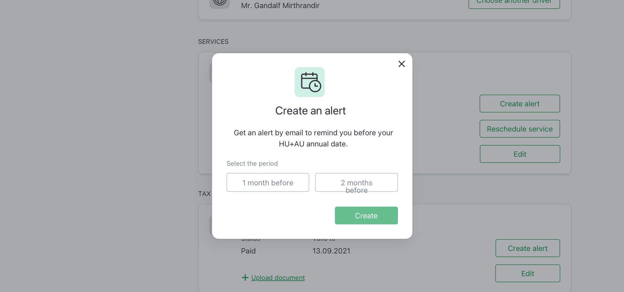
Reduce the number of emails received (when registering) to minimise confusion on where to click.
Simplifying the onboarding steps to reduce time and effort.
Making the onboarding process friendly and personalized to enhance user connection.
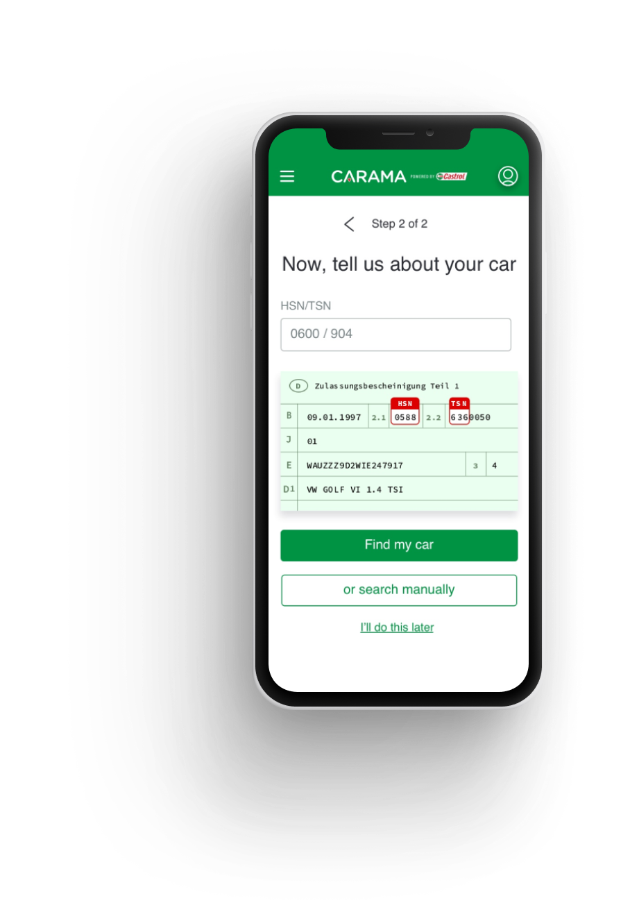
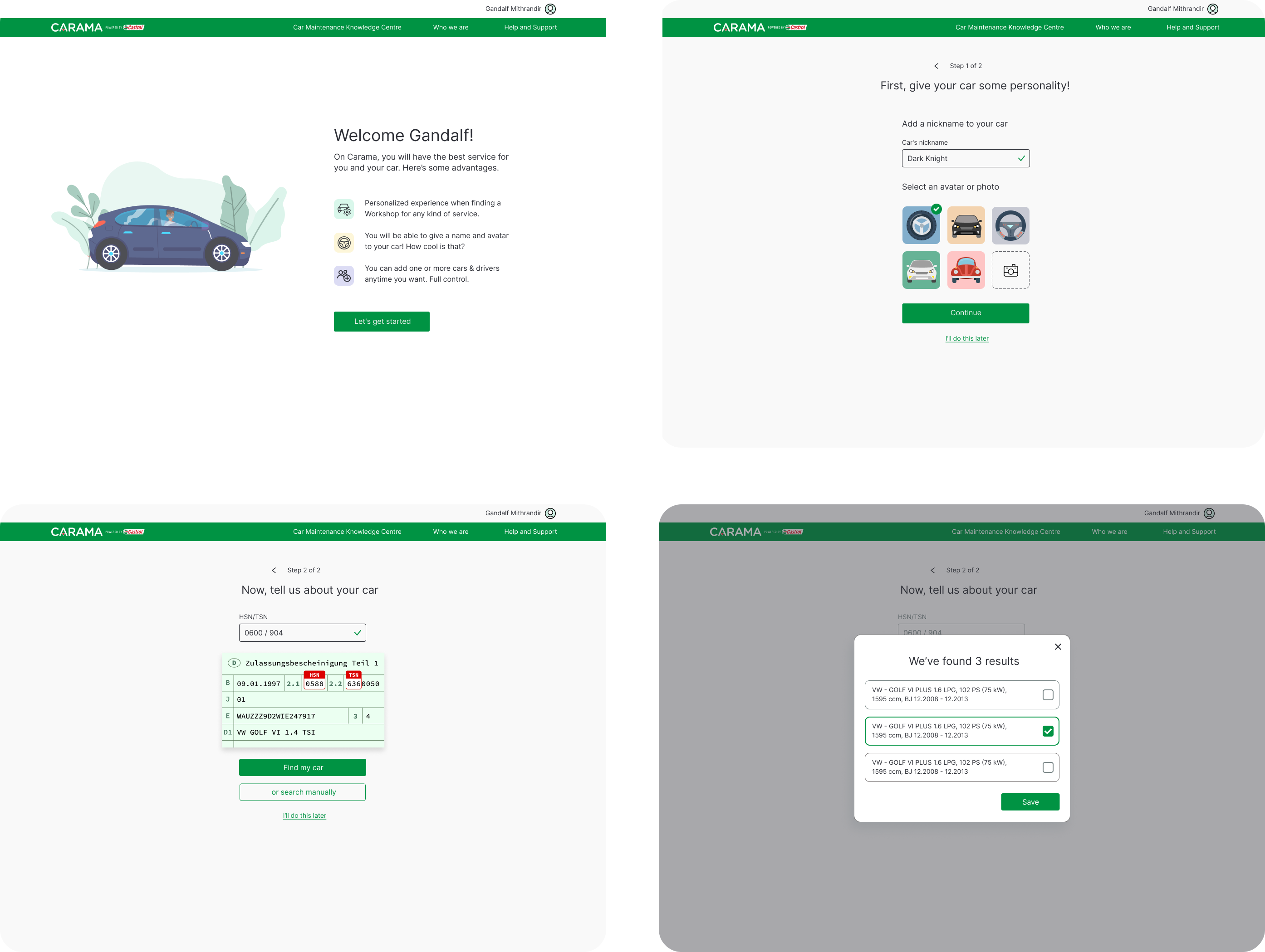
Establishing a painless car registration process
On the onboarding process, I made sure to:
create a friendly approach.
to include the total number of steps of the process.
to add personal customization so the users feel more connected to the product.
give the user total flexibility to when filling in their details.
Time to start to "get our hands dirty"
As any real project, technical constraints were present:
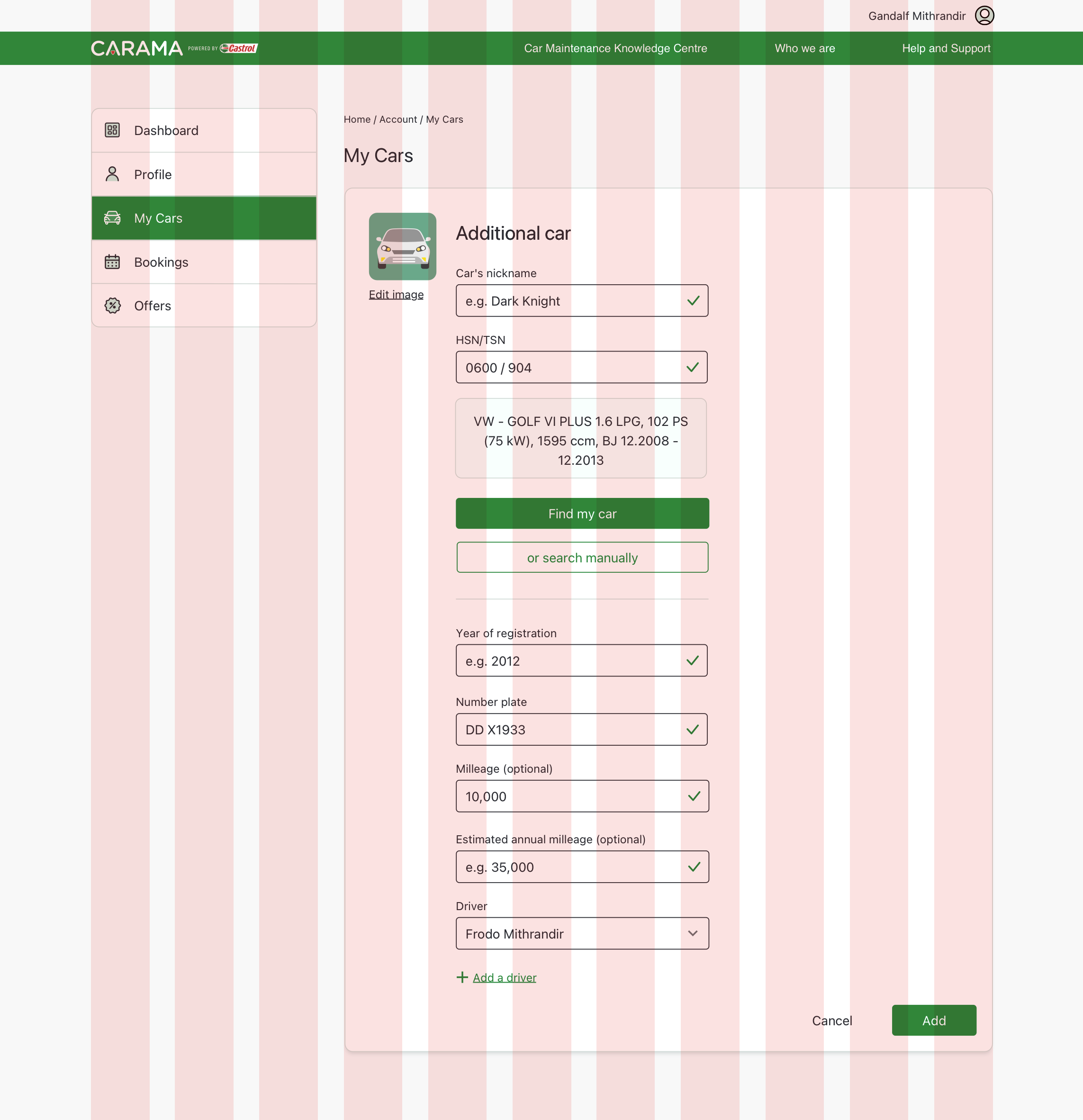
Password creation couldn’t be added to the initial sign-up modal due to internal and third-party limitations.
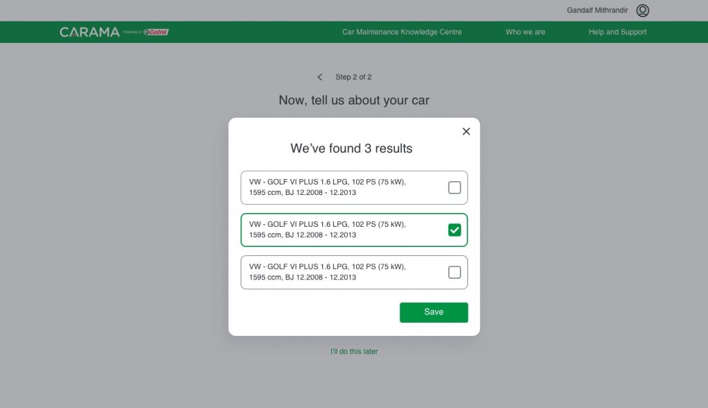
Automatic vehicle lookup was not feasible, introducing a new requirement for the project.
As a UX designer, I advocated for our users by:
1
Proposing social sign-up options (Facebook, Google, Apple) to avoid the need for password creation, addressing a persistent issue from previous attempts.
2
Implementing a manual car information lookup as a provisional solution for identifying vehicles.
This approach addressed the immediate need for users who might not have their car registration handy, although it wasn’t ideal. This quick solution was necessary to keep the project on track and avoid jeopardizing the overall business objectives.
Hands-on
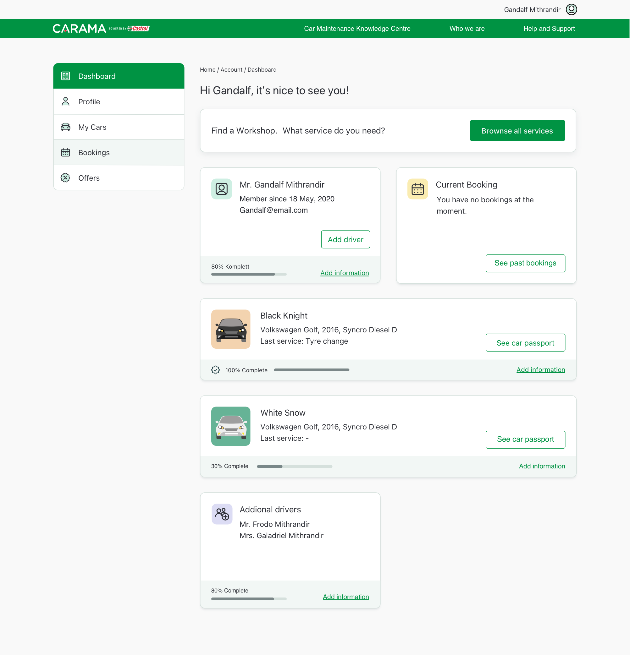
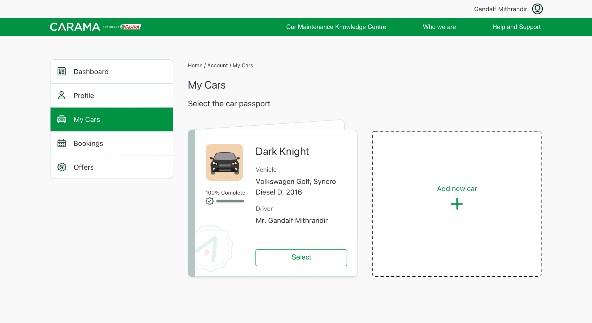
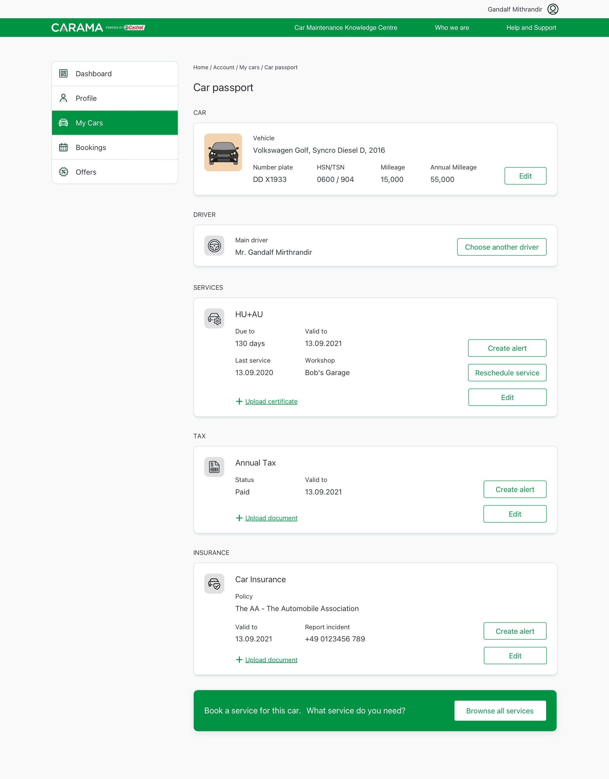
The customised Dashboard
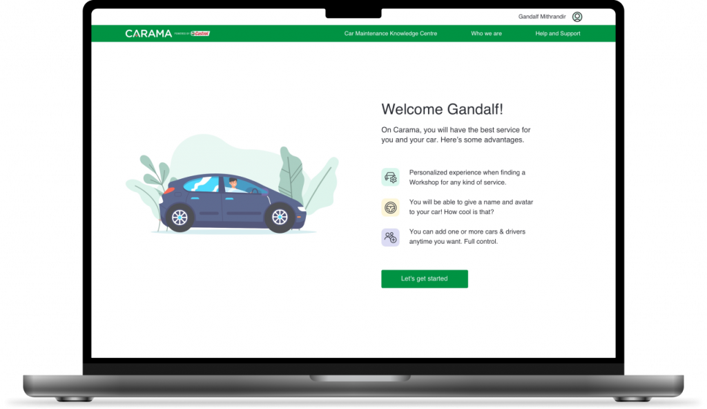
When designing the user’s dashboard, I took in consideration usability heuristics and UX principles, such as personalization experiences, aesthetic usability, and reciprocity principle where we show the costumers we listen to their needs and give them more than they expect.
Results
Reduced the average onboarding process time by 30% compared to the B2B approach.
Minimized user confusion by simplifying the onboarding steps to reduce time and effort.
Made the onboarding process friendly and personalized to enhance user connection.
Increased user satisfaction and adoption rates by designing a customizable dashboard tailored to their needs. Users felt more connected to the product.
Improved the user engagement and sign-up conversion by 27% when adding personal customization, so the users feel more connected to the product
My Learnings
Secondary Research (Desk Research): Crucial for project efficiency, leveraging existing data on personas, empathy, and blueprints accelerates discovery. Always explore previous research and materials for added insights.
Heuristic Evaluation: useful for identifying usability issues within the current user journey, helping to improve product usability.
Know how to use progressive disclosure on onboarding: revealing additional, contextual questions only as needed.
Project Constraints: view technical or budget limitations as opportunities to refine and focus the design process. Embrace constraints to explore feasible ideas and ask “what if?” to guide innovation.