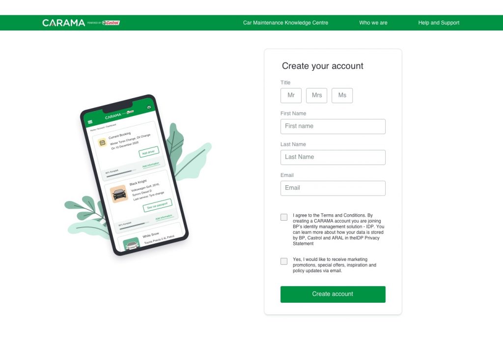
Designing Account Creation

Implementing the sign up (subscription) & onboarding process

Portfolio - Designing Account Creation​

Overview

The Carama project, powered by Castrol, is a digital platform that connects car owners (B2C) with trusted garages and workshops (B2B) for car maintenance and repair services. 

This service facilitates easy booking, comparison, and selection of garages that best meet the users’ needs. 

Role

I led the design of user flows, wireframes, prototypes, evaluation and the delivery of final designs.

User Experience; Wireframing & Prototyping; Strategy; Usability Testing; Data analyses.

Responsibilities​

  • Understanding the business context, project timeline, resources, and constraints.
  • Designing user flows, wireframes, prototypes, and delivering final designs.
  • Conducting user research, wireframing, prototyping, strategy, usability testing, and data analysis.
  • Leading the design of user flows, wireframes, prototypes, evaluation, and final delivery.
  • Collaborating with developers to understand technical constraints and ensure feasibility.

The Problem

Our platform supports both B2B and B2C services, but initially lacked a registration process for B2C users. This gap highlighted issues for B2B users, such as confusion caused by receiving three different emails during registration and complications from the absence of social media sign-up options.

Solution

We aimed to streamline the sign-up and onboarding process by:

UX Prototyping - Onboarding

Process

The first step was to understand the goals of the business and the users’ needs.

The idea here was to have a clear definition of the design problem. And, in order to acknowledge how the design could support our goals, we firstly had to understand the business context.

And not less important, we had to investigate users’ goals and needs to understand as much as possible about them and their context, hence making their life as easy as possible with the right balance between simplicity and practicality.

We were an Agile team, working in 2 weeks Sprints.

Understanding goals and users

Based on the Design Thinking Methodology, we organised interviews and activities with our stakeholders capturing project details such as business context, project timeline, resources, constraints (as I mentioned above).

The main questions answered were:

UX Project Workshop

With that in mind, we were ready to know more about our users’ needs. So it was time to tackle Secondary Research.

Previously, in this project, UX researchers had conducted qualitative and quantitative research with our users (B2C). Therefore, we had already some data defined such as a persona, empathy map, and blueprint.

The most interesting part of this phase was when we found out, by our research, that our current users (B2B – garage owners) were having a difficult time registering to the platform in the current journey. Since we were going to use the same type of user registration (SalesForce), that would also be a problem for our new registration process.

Understanding the current flow

We needed to familiarise ourselves with the current registration flow, that was a fact. The whole process was confusing. It was time for a Heuristic evaluation.

First, when the users were trying to register, they were receiving three different emails — Thank you email; Welcome Email + Link for confirmation; Marketing opt-in email confirmation. It was just too much.

Second, users were not able to sign-up any using social media which, nowadays, I would say it’s a must-to-have in order to simplify sign-in and registration experiences and, at the same time, to provide a convenient alternative to mandatory account creation.

Based on that and on the information gathered from research (we also did some competitor analysis), we started building User Flows As-is and To-be.

I was always working closely with the developers to understand any technical constraints — from third-party service providers or what technology we were and weren’t allowed to use.

UX User Flow
UX User Flow

We created user flows for 2 different starting points:

1. one where the user would register from the homepage;

2. another where the user would register from the Search & Booking journey (see image above).

Ideation

We also run some ideation workshops to generating ideas and to identify potential new solutions for the problem we were trying to solve — bringing features and functionalities, for instance.

Something I brought it up and that I really like to use in this phase is the User Story technique, where we create user stories using natural language to explore the user’s context and needs.

👨🏻‍🦰

As a car owner I want to view my bookings so I access information about it anytime.

👩🏽

As a car owner I want to easily find my car information so I save time when booking a new service.

With all research done and ideas flowing, it was time to start to “get our hands dirty”.

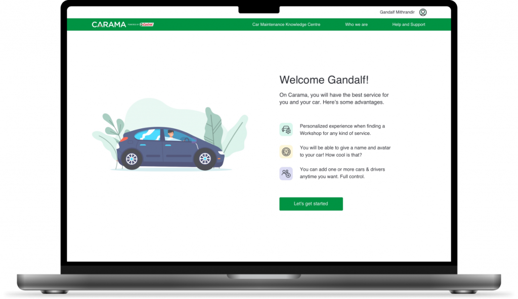
In this stage, we came up with ideas for how the sign-up process and onboarding process should look like.

Here are some points we addressed when coming up with solutions/ideas:

UX Sketch
UX Sketch
UX Sketch

I then mocked up some basic wireframes to gather feedback from the design team, our product owner, the developers, and the rest of the team.

On the onboarding process, I made sure to:

Worth mentioning that within a project it’s very common to have technical limitations, and this one was no different.

1. It wasn’t possible to add password creation on the first sign-up modal (due to internal/third-party constraints).

2. Costumers couldn’t identify their vehicle using an automatic vehicle lookup — that would set a new requirement for the project.

As a UX designer, I had to advocate for our users (always!).

Here were our actions to solve the problems mentioned above:

1

That was not a new issue, other members of the team had tried to solve this problem before with no success. 

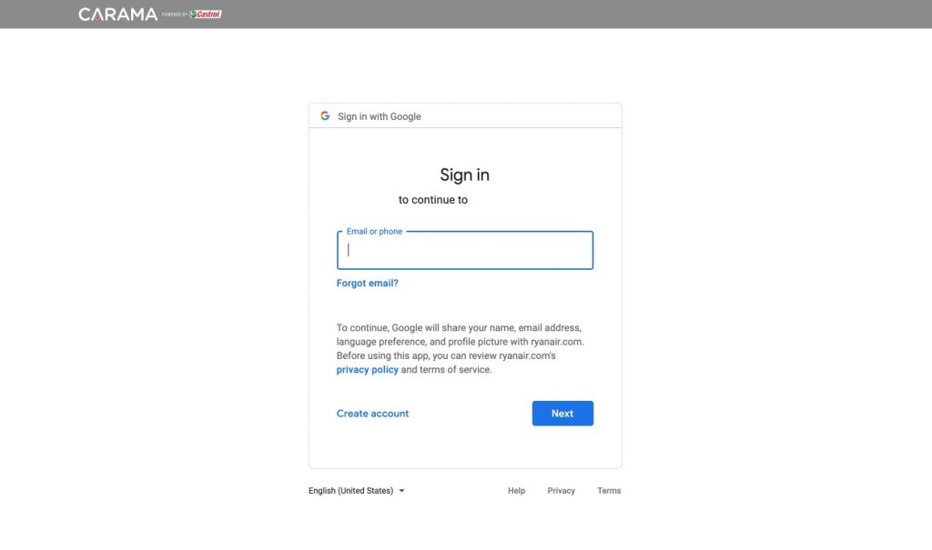
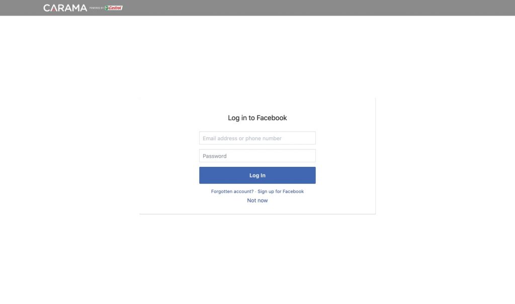
Therefore, we tried to tackle the problem from a different perspective: strongly advocating for the implementation of social sign-up (Facebook, Google, and Apple as the most common found in my desk research), meaning that the customer wouldn’t need a password creation.

2

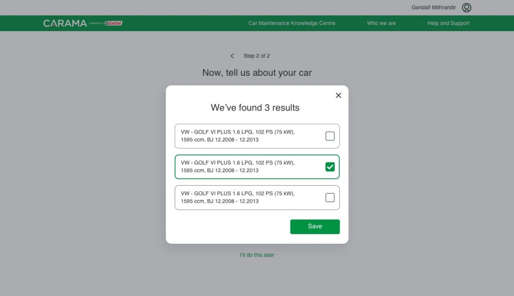
We raised a new requirement where the user could efficiently identify their vehicle by entering their car registration AND if there was more than one car variant and/or year covered by their car registration, then the consumer would have to be able to select the specific variant and year from a list.

Since that was a long shot due to the involvement of third parties and business agreements, we found a quick win (provisory solution) for this problem — a manual lookup.

When filling out the form, the customer would type their car information, such as Make, Model, Year, and Variant. That solution was anticipating another problem where many of the customers who wouldn’t know their car registration off the top of their head or have it to hand, would then be able to easily fill it out with their car information.

I know this is not the best solution for users. However, in the context that we had (MVP), not finding a quick solution would jeopardize the whole project affecting the business as a whole.

UX Onboarding - about car
UX Onboarding - results found
Mobile UX Prototype
Mobile UX Prototype

This was the last step before testing with the users, but due to budget limit we decided as a team to get our hands on the dashboard creation.

In order to avoid a really long case, I will divide it into two parts – “Designing Account creation — Dashboard (part 2)”. 🙂

What I learned from this part of the project?

Check my other UX Cases 👇

Shell Market Hub Download Centre​

Increasing productivity and reducing annual costs by solving challenges faced by the Marketing Team

*Password protected.

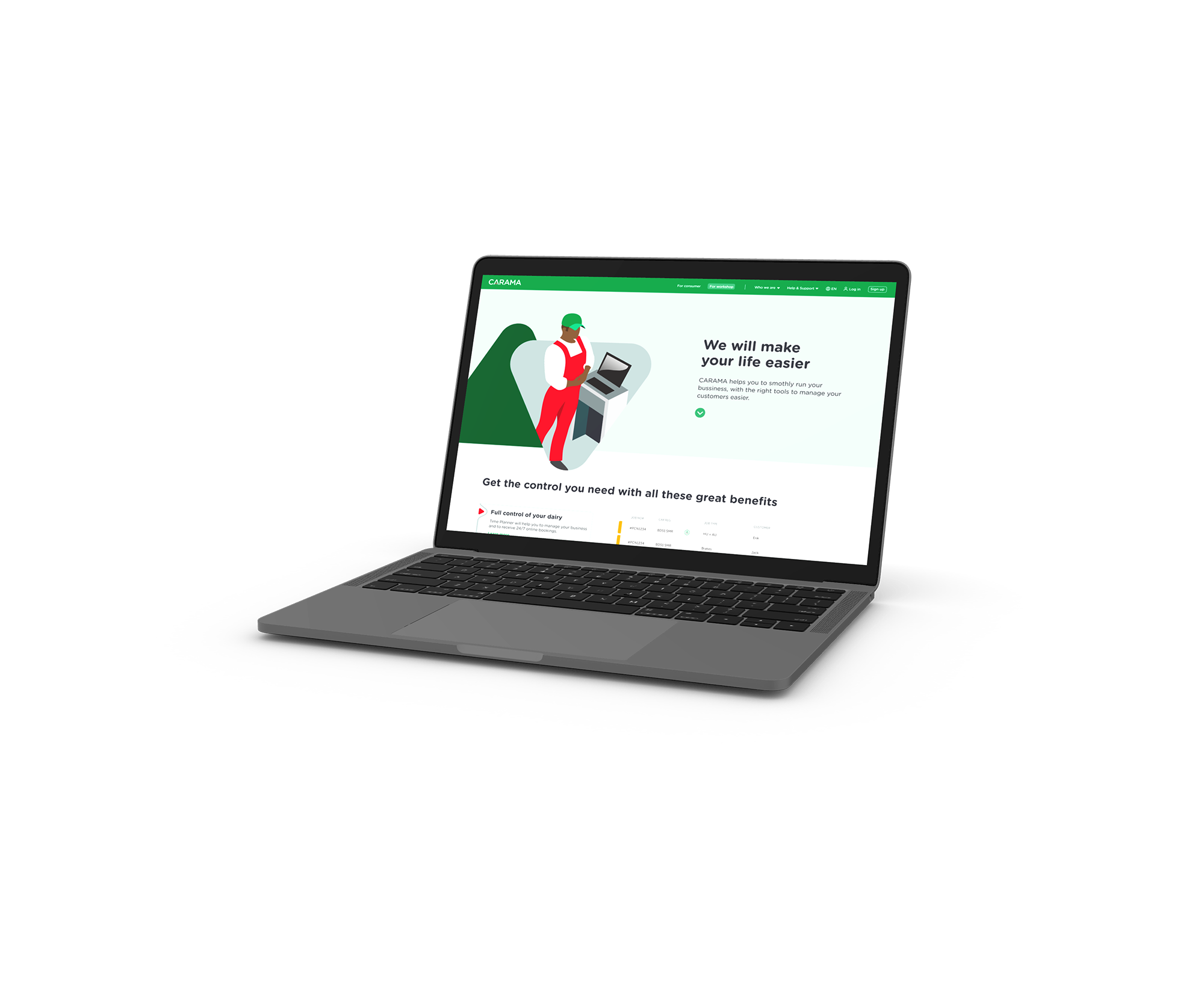
Redesigning B2B homepage for Carama

Increasing sign-up conversion by creating solutions for a sharp drop-off

Feel free to
agatayamashiro@gmail.com

Home  |  Work  |  About  |  LinkedIn  |  My CV

Agata Yamashiro © 2024 – All rights reserved